Twisted Tree Therapeutics · Branding · Commissioned identity
A mark for a massage therapist who drives to you
One therapist · no storefront · six services and a QR code that all had to fit on one card
The brief
Elaina runs Twisted Tree Therapeutics as a mobile massage practice. She drives to people across the Phoenix valley, from Maricopa up through Chandler, Mesa and Scottsdale. There is no studio address. People meet the brand three ways. A card in a driveway. A phone screen. A folding table at an event.
The name comes from the old junipers around Sedona. They grow in a spiral, straight out of bare rock. She wanted that in the mark. It had to read as endurance and growth, not as the usual spa lotus flowers and smooth stones.
That set the constraint. The card is the main surface, so a mark that only works large is no use here. Every direction got the same test. Does it still read at thumbnail size?
Constraints: One person, print first, and no retainer for ongoing design. She had to be able to reprint it all for years without coming back to us for a file.
How it was made
-
Reference
We started from the actual tree rather than a mood board. The spiral trunk and the exposed roots were the two things the mark had to keep.

The tree the practice is named after. -
Palette
The colors came off the same landscape: red rock, dry sage, bare wood. Warm enough to suit body work, and few enough that the card could be flooded with one of them and still look deliberate.

The palette study. Sage and maroon became the mark. The card green came from the same set. -
Directions
The first mark was an illustrated tree: modeled trunk, shaded bark, a lot of detail. It held up on screen and lost that detail the smaller it got. Small is where this brand lives, so we cut it.

Rejected. Too much shading to survive card size. -
Mark
The final mark is two flat colors and no shading. The canopy reads as leaves at a glance and as a spiral up close. The roots carry the same visual weight as the branches, which is the half of the name most marks would have dropped.

The mark that shipped. -
Lockups
Stacked and horizontal, dark text and white text, and the mark on its own. Handed over as SVG and PNG so she can drop the right one into anything without needing a designer to cut a new file.

The stacked lockup, one of five variants delivered. -
The card
The card carries the whole practice: six services, a phone number, and a QR code that opens her booking page. The tree drops back into the green as a watermark so the text stays first. It is the only piece that has to carry all six services at once.

Card back. The front carries the mark alone.
The deliverable, as printed
This was identity and print, so the handover was files. This is the set she reprints from, at the size it ships.
-

Horizontal lockup, dark text. -

The mark alone, for stamps and small applications. -

The printed card back.
What we delivered
- 5Logo lockups delivered, each as SVG and PNG
- 6Services the printed card had to carry
- 2Mark directions drawn. We cut one for losing detail at card size
The line the identity had to carry
"Rooted in Resilience, Guided by Healing"
The practice, trading
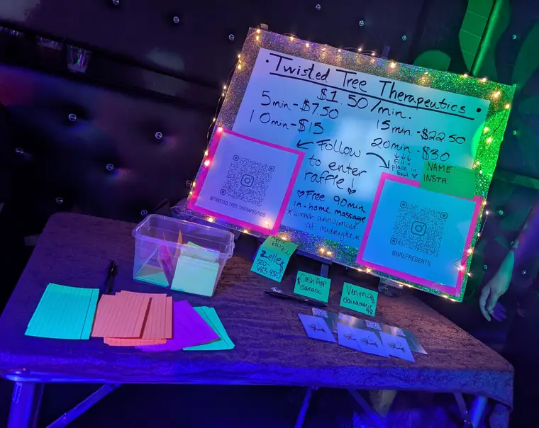
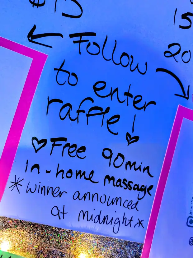
Two photographs from a September pop-up. The printed cards and the QR codes are ours; the price board that night was hand-lettered. photos from the night